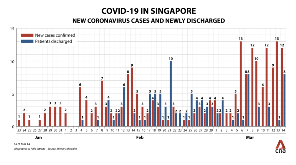
Task 4: Replicating and Improving a Chart
The chart image we are working with:
Replicated Chart:
Improved Chart:
We've organized the page into sections, with each section containing a chart, title, and description. Here, we can describe the chart and give some context. As a first example, we're using a basic chart from our repo.
Chart 1: The first visualisation is a bar chart illustrating Primark's annual revenue growth from 2007-2023.
Chart 2: This chart illustrates global fast fashion spending patterns from 2007 to 2023, comparing countries based on average items purchased and cost per item.
The graphs created from the Economics Observatory API display U.S. GDP growth and nuclear power output trends from 2000 to 2023. The first graph highlights economic growth, and the second focuses on nuclear energy production.
Visualisation 1:
Visualisation 2:
I encountered an intriguing argument about the importance of diversifying teachers to foster discussions on the British Empire's colonial legacy. My visualizations highlight the need for greater diversity in the teaching workforce.
Visualisation 1:
Visualisation 2:
The chart image we are working with:
Replicated Chart:
Improved Chart:
I chose to scrape Wikipedia because its tables are static HTML, making it an excellent resource that allows direct data access using BeautifulSoup and pandas.read_html().
Click here to view the scraper project
Visualisation:
Developed visualisations of GDP trends for nine major economies from 2010 to 2022. Utilised the World Bank API to fetch real-time data, processed it using a Python notebook in Google Colab, and created responsive charts with Vega-Lite.
I have made a base map and an Interactive Choropleth Map which is showing US Presidential Election turnout in 2020,2024. I have done this by integrating a csv and TOPOJson to map the US and using an AlbersUsa projection.
Base map:
Interactive Heatmap:
Bubble Chart:
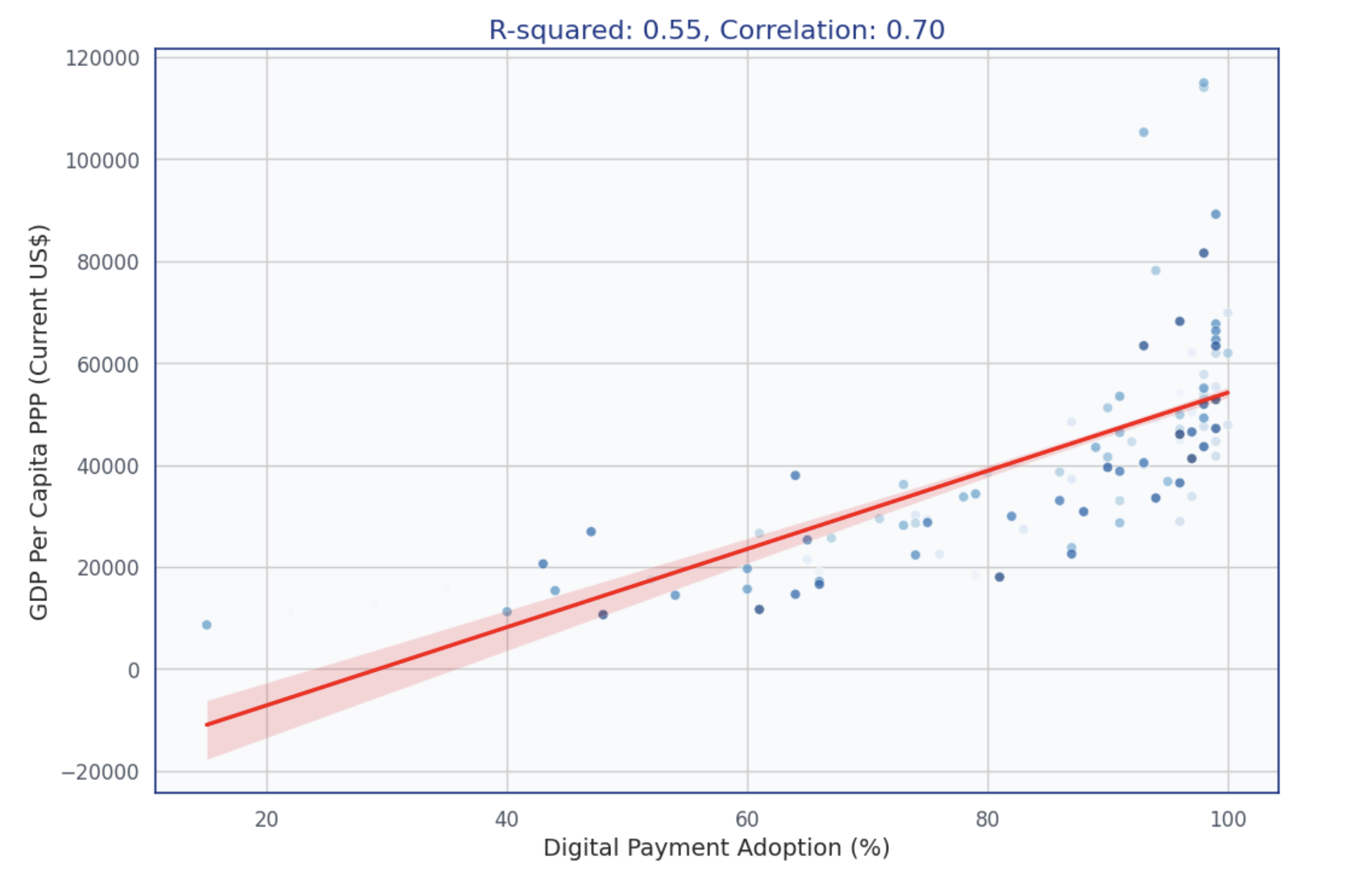
Regression Scatter Plot:
For this task, I loaded the data into Google Colab. Using pandas, I filtered Parmesan and Soft Continental Cheese data by IDs, extracted year_month, computed average prices, reshaped with pivot, renamed columns, removed missing values, and exported a cleaned CSV:
Click here to view the data processing
Parmesan Price Graph:
Soft Continental Cheese Price Graph:
Interactive Heat Map:
Interactive Bar Chart: